Why Yellow Isn't Always Best
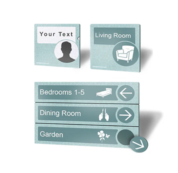
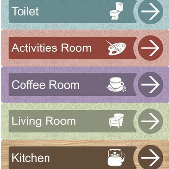
Dementia friendly signs are essential to creating an environment where dementia patients can live comfortably and feel at ease in their daily lives. People living with dementia may often find it difficult to remember simple things, such as where to find the toilet or their own bedroom.
All building features of a care home should be considered carefully, as to create an environment that is relaxed and easy to understand. A care home should be a place that a person with dementia can feel safe, secure and at home. The dementia friendly signage you choose can be the finishing touch that complements the rest of the care home.
According to Time Magazine, brain stimulating activities have been proven to help diminish symptoms caused by dementia, such as forgetfulness. Intellectual activities such as putting together a puzzle or painting a picture can stimulate parts of the brain that normally may be neglected.
For years care homes have been looking to provide signage that helps their residents, especially those with dementia. So have been opting for the “High Vis” options that seem to be the only thing that meets their requirements on the market. The problem is, it doesn’t look good! So when it comes the carefully considered and designed interior of a home, many care homes have been forced to ruin the ambience with the
signage available to them.
When designing dementia friendly signage, there are three very important aspects to consider:
1. Contrast
2. Ease of Interpretation & Visibility
3. Calm Feeling
1. Contrast
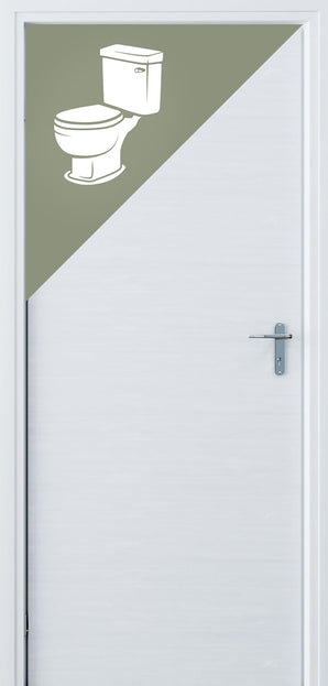
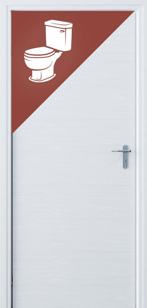
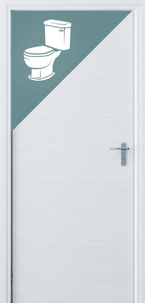
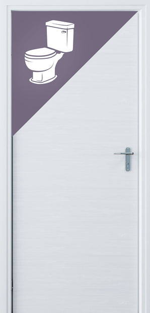
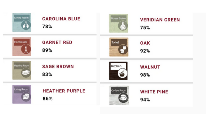
There is no denying that high contrast is of huge importance for dementia friendly signs. However, a common misconception is that the only way to achieve this contrast is by using the ‘yellow & black’ or ‘yellow & red’ colour combinations you often see. Certainly, these colour combinations do have high contrast, but they are not unparalleled. You should not feel that you are limited to use these in order to create a dementia friendly environment. An industry rule of thumb is that the contrast value on dementia friendly signs exceeds 70%. This infographic displays the LRV values of the signature Signage for Care colours:
All of our colour options exceed the recommended 70%, and most go above and beyond. The common yellow & black dementia signs have an LRV contrast of 94%, which is even less of a contrast than some of ours!
2. Ease of Interpretation & Visibility
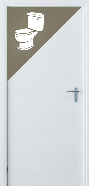
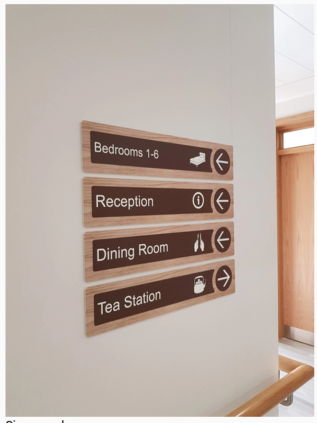
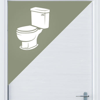
Dementia friendly signs should always be easy to interpret. The easier to understand, the better. Cognitive difficulties and disorientation in dementia patients can make it challenging to understand over complicated text and icons. This can cause stress and anxiety in the patient that could have otherwise been avoided.When a person with dementia looks at a room sign, it may be difficult for them to interpret the text. Therefore, it’s important to design the room signs with large, simple and clear icons to help ease any confusion. To further help ease visibility of the icons, the dementia friendly signs should always have a matt finish. If the sign has a glossy or reflective finish, this can
hinder the visibility for dementia patients.
3. Calm Feeling
According to the Universal Design Guidelines for Dementia Friendly Dwellings, there is one last important question to ask yourself when considering dementia friendly signage: Do the signs create a feeling of calm? A care home should always make a dementia patient feel comfortable and at ease, the signs should also follow this standard.In signage, yellow is a colour that represents hazard or danger. It indicates that an area is dangerous and that you should be careful. It does not symbolize a calm feeling, especially for dementia patients
who are already suffering from cognitive difficulties and confusion.
Living with dementia is challenging. It should be our top priority to create a home that dementia patients feel safe, relaxed and comfortable living. Being able to have the independence of finding your bedroom or bathroom without help, can vastly improve the quality of life of someone living with dementia. We should strive to create dementia friendly environments
that feel nothing short of ‘home’.
Shop The Range
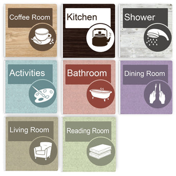
1A Accredited by the University of Stirling's Dementia Services Development Centre.Our signs make living with dementia that bit easier. The range is high contrasting, texturised and with custom designed iconography to make them prominent and recognisable without compromising on aesthetics.

Signage Consulation
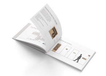
Send us your drawings, we'll do the rest. No limit on the size of your floor plans. We will design a full wayfinding schedule to solve all your problems and create a dementia friendly environment that looks great.
Turnaround Time: 3 business days from when you submit your drawings.
What You Get: A full wayfinding schedule in PDF format to best suit your floor plans
We do not offer refunds on our consultation service. However, if you decide to purchase our signage - the €99 will be automatically credited to your account.

Commercial Enquiries
If you aren't sure what you need we can help with that too. We offer a full consulting service to develop a wayfinding scheme for your building.