Getting Your Care Home Signage Right!
Care homes are an important part of our care network, providing expert care and services when we need them. Care homes have been developing over the years and now many of them resemble 5* hotels. But when it comes to the interior of a care home, it is often ruined by something we normally would be proud of, Signage!
For years care homes have been looking to provide signage that helps their residents, especially those with dementia. So have been opting for the “High Vis” options that seem to be the only thing that meets their requirements on the market. The problem is, it doesn’t look good! So when it comes the carefully considered and designed interior of a home, many care homes have been forced to ruin the ambience with the
signage available to them.

Listening to the Care Industry
This was the feedback we had been receiving from care homes up and down the country, that there wasn’t an option that worked for their home. They had the options to create something bespoke but many found this not only too costly but also raised questions on how effective the signage would be for the residents. Or they could use what was available in the
market, but that would be fair to great a compromise. What is important when selecting signage for the care environment is to focus on who the end-user of the signs will be. The primary users will be the residents, followed by visitors and staff, which previously made searching for a signage solution a challenge.

Revolutionising Care Home Signage
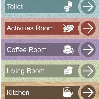
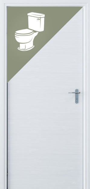
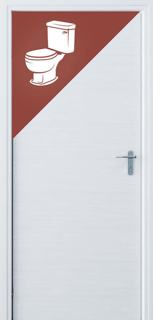
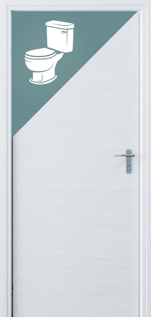
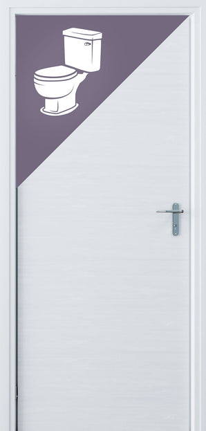
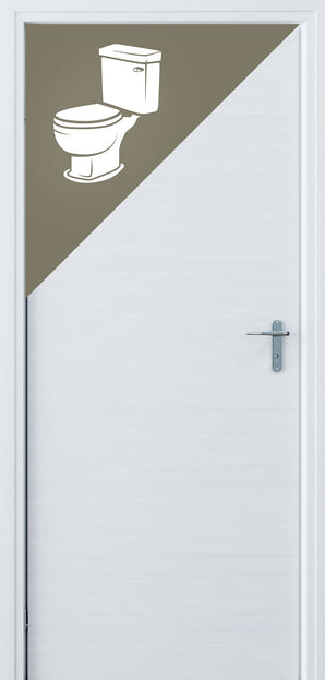
With accreditation from the University of Stirling, we are pleased to bring to the market the alternative. Dementia-friendly signage that looks amazing in your home and not only cares for your residents needs with but also enhances your interior design.
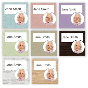
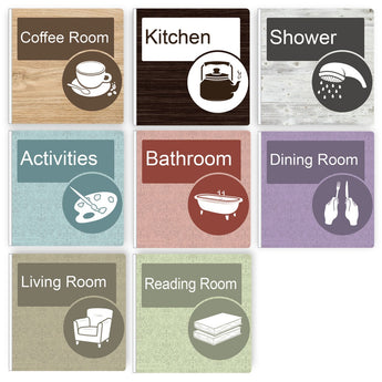
With 8 new options available including wood finishes and more aesthetic colours ranges, care homes are now able to provide the right type ofsignage for their residents, and still make the care facilities look amazing.
All signage is tactile adding that sense of touch to the normally flat signage traditionally used, so
residents can experience the signs in more than one sense.
Tips for Selecting Care Home Signage:
1. Ensure there is a good contrast between the sign and the surface it is being
fitted too. Don't match your sign to the same colour as the surface, find a complementing colour or an accent used elsewhere in the home.
2. Make sure you signs are placed at the right height, people living with dementia tend to look more downward, so ensuring the signage is placed in their eye line will help with their navigation throughout the home.
3. Mix up your colours depending on which floor you are on. Having different colour signage on each floor can help residents easily identify where they are.
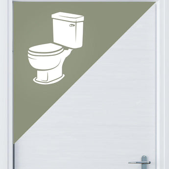
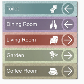
4. Look for signage with a clear icon or image. Multi-coloured pictures often don't meet the contrast requirements, so look for something clear and obvious as well as high
contrast.
5. Find signage that you can trust. Make sure your new signage is fit for purpose, by looking for accreditation from a well-respected organisation.
You can view our entire dementia friendly signage on in our shop or get in touch for more information.
Signage Consulation
Send us your drawings, we'll do the rest. No limit on the size of your floor plans. We will design a full wayfinding schedule to solve all your problems and create a dementia friendly environment that looks great.
Turnaround Time: 3 business days from when you submit your drawings.
What You Get: A full wayfinding schedule in PDF format to best suit your floor plans
We do not offer refunds on our consultation service. However, if you decide to purchase our signage - the €99 will be automatically credited to your account.
Commercial Enquiries
If you aren't sure what you need we can help with that too. We offer a full consulting service to develop a wayfinding scheme for your building.
Shop The Range
1A Accredited by the University of Stirling's Dementia Services Development Centre.Our signs make living with dementia that bit easier. The range is high contrasting, texturised and with custom designed iconography to make them prominent and recognisable without compromising on aesthetics.

